Showing posts with label JAPAN. Show all posts

Wednesday, 22 October 2014

Sou Fujimoto - notes from a lecture

As the weather gets colder, the Carnegie Mellon University Fall 2014 Lectures Serie  is a very nice alternative to outdoor activities. I am not saying this because of their heating system - like those people that would go shopping to the malls only for seeking cool AC over summer. 
I truly believe Fall is a cultural season: no better way to warm up your creativity than attending lectures.

Today I will do a little experiment on the last lecture I followed: Sou Fujimoto (October 20th) talking about his architecture. I took notes on my iPad. Here, I will post the notes, just slightly edited.
----------------------------------------------------------------------------------------------------------------------


Notes from the lecture 
"Between Nature and Architecture"

Sou's goal: create a living environment for people
Sou's obsession: How to integrate Nature in the Architecture

Sou was born in HokkaƬdo (a lot of nature) and moved to Tokyo (a lot of concrete and chaos)
Nevertheless, he perceives Tokyo not as a crazy city but as a comfortable city. Why?
Tokyo situation: ugly and artificial, but there is a similarity between Tokyo and the nature
Tokyo is made of a myriad of little things. It's a chaotic and "a full situation"
The result of this packed environment is "coziness" 
There are so many little details, that this scale give you a sense of comfort.
And in Tokyo, as in a forest, you can walk around freely, protected and hidden by all these details.
Plus, you can always find out something new, something different, as it happens in a forest.

Photo by Bea Spolidoro - Tokio 2008

Which is the relation between the artificial complexity and the natural complexity?
Sou feels he discovered it working with the scale and the density of the elements.
He looks for a <<nice interaction between architecture and nature>>


Serpentine Pavillion (2013) for the Serpentine Galleries

© Daniel Portilla

Simple  concept: it's a cloud out of a structural grid
The repetition of the line creates different densities, for a cloud effect
The structure creates small cubes: he added glass to walk or sit on it.
There is a plastic roof, transparent.
He got the inspiration from the first site visit, by seeing a tree without leaves.
Simple rules, good balance between simplicity and complexity
It's a multipurpose space with a cafe

He thought first of the concept: like a landscape where people can stay
Then: how you do it?! 
Grid and transparency
The structure has been done by a computer in London
But after the structure was ready, no one had idea of how the space actually was like
Then they did a model to find it out
Luckily, it looked nice
Crazy process

From the outside, at first you cannot understand the space
As you get closer, you understand it
Transparency depends in the density of the structure
And it keeps changing according to were you are, where you walk
it's an "organic changing" around you, based on an artificial structure
See the shadows too! They contribute to the cloud effect.

The scale is important when creating impressions
The light by night comes from the ground
It makes it floating...
Architecture, landscape, furniture, inside outside...
It's all about phenomenon


House NA


Similar strategy, but this is a private house!
He tried to find out the integration of different basic condition
It was for a young couple, on a small site
You cannot get big room on a small site
So you have to integrate the spaces and combine them
Stack them on different levels, to get different area (not rooms!)
You have one room, articulated on many levels
The house inside resemble the tiny streets of tokyo
And the density allows the diversity and the possibility of many living choices

You are like in a tridimensional and artificial forest
Then there is a lot of glass, it's transparent
He asked the clients if it was too open, but they didn't want walls, at all
There are some curtains, designed and layered out by the client
The curtains are at different distances from the glass
This gives different density and scale


Souk design - particles of light

image Sou Fujimoto

Only designed, never built, for a competition
1 mile long - everything is possible in the Middle East
8 towers  around 100 m high
There are many voids, to create the "cloud" effect and vibrancy
Big voids to create breaks and to feel the rhythm
There is natural ventilation, vertically
The geometry is made by small units (arches) in a grid, repeated
It is the same concept and system of the Serpentine Gallery pavillion
It's a shape like a bedouin tent
It's a crazy idea: brought from a smaller scale to an extreme scale

Then the competition stopped suddenly
The king said to stop right there, that's it
And that's the middle east
Anything is possible


Toilet in nature

image Sou Fujimoto


It's a real public toilet, in a small village, for a train station
They needed only one public toilet!
It's a very small project, minimal scale
It's just a toilet in a glazed box, all transparent
It is public, but the toilet is a private space!
How to integrate the public and the private need?
How to block the view? How to integrate the opposites?
Divide the spaces! There is a gigantic wall around
It has two boundaries: the fence around (opaque) and the glazed walls
So now you see, but no one can see you.
He integrated existing trees inside the fence
The fence technology is simple: just poles in the ground

Lots of people came to see the toilet
And kept coming. They were too many, for only one public toilet
So they had to do more toilets. But they did the chemicals
And they put them inside the fence, behind the glazed toilet...


House N

image Sou Fujimoto


Another project that works with the boundaries
It has three boundaries
Tree boxes, one inside the other, with openings on walls and ceilings
The definition of outside becomes ambiguous
He revisited the traditional Japanese house, with indoor/outdoor relation
Creating gradations of the walls: one or many?
An old couple lives here: they asked only for a flat floor
Flat conditions, but there is a different way to create a gradation
The biggest box is open and contains the garden. No glass there
Then there is the other two, where you live
From inside you see three layers of walls, but it's very open to the sky
Some areas are very hidden, others are very open.
Again, you choose, every time, what do to and "how"
Everything keeps changing, inside a built structure
Nature and city
It's a beautiful example of how to integrate inside and outside in architecture


University Library in Musashino


Images Sou Fujimoto

The university choose Sou's firm  because they were all young
They won the competition
The theme is the forest of books
Systematic space and well organized, to find books
But it's like walking in a forest
It's a place for the inspiration
You can be surprised by a special finding, or go straight to your section and book
How to integrate the different idea? Wild forest and a precise cataloguing system?
Book walls wraps like a spiral
If you stay in the center, you can see all the sections, through the openings
The spiral goes out to the outdoor spaces. 
You can potentially continue the spiral for future expansion.
It can grow. Just add a roof!
Polycarbonate, transparencies and skylights
Nice expectations
There is a cozy scale, of the books, but also the almost infinite one, of the concept of a spiral.
You can choose to read in a cozy corner, or just walk around the library, in an infinite way


L'arbre blanc


High rise building in Montpellier (France)
How the opposites can come together: another good example
How to find a new typology for a housing tower, respecting tradition?
Need to respect the mediterranean climate and culture, also

They proposed a crazy monster of balconies
Lots of balconies: old strategy, but modern idea
Intense way to go beyond the boundaries
It's both fundamental an old, but new
The balconies come from the Montpellier Tradition
But the structure is a magnificent spiral
It's an organic creature, or a tree

The "lifestyle" of the balcony is very important in Montpellier
People in the jury were very pleased to see this reinterpretation of a tradition
Will be done in 2018
They are selling the condos now
Wanna buy one?

Saturday, 2 March 2013

Finch Fight - Bird is not the only word

March 1st Gallery Crawl on Penn Avenue (aka Unblurred) confirmed once more it's always worth visiting. Despite the bitter cold and the freezing breeze. 
At ImageBOX, in particular, you can always be sure you'll see high quality art. This is how I discovered Abby.

Abby Diamond is now presenting some pieces from her work "Finch Fight" in this space and as I entered the place, I had no idea about what I would have seen or found. The drawings on the walls, hung in a simple way, were very powerful and really well drawn. I loved the clear lines, but also the wise use of colors, and the elegance of the technique (I first thought the illustrator was a male, but very gentle!)

From her profile on Tumblr, I discover that she is "an illustrator in Pennsylvania, and these are my adventures fresh out of college. You may see a lot of birds here". 
After seeing the drawings I spotted her in the crowd and sincerely congratulated with her. She is very nice and kind, but her drawings show also a strong character, precision, elegance and energy - all at the same time.

As I was walking through each piece, I was studying the lines that define the figures. There is something Japanese in these drawings, as well as something taken from the fairy tales. The over-all aesthetic reminds me of the Japanese prints of Sesshu Toyo or Kanu Eitoku, a little more complex of course. The shades of some shadows in the background, though, are very oriental, in a way. 
Then there is the subject: magic animals? Enchanted woods and ponds? Dream or reality?
The precision of the illustration, botanical for the plants shown and very anatomic for the animals, clear most of the doubts: these "creatures" do come from reality, but are just presented in a different way. Reality can be magic, if you look at it from a different perspective.

Abby's work (above) and Kanu Eitoku (below)

I generally prefer simple drawings. These are very complex because made of a number of layers. Japanese prints are mainly 2D, while Abby puts a lot of details into her drawings. Nevertheless, this adds magic to the magic, because each piece, so rich in details, has the power of a story. 
It's impossible to just peep at her work. You are naturally captured and you start following all the lines that, inch after inch, develop a interesting narrative. The more you look, the more you discover. 
This process has a logic, easily followable, that gives you the pleasure to look at Abby's work. It's easy to add a lot of detail stacking them up like crazy. There is plenty of angry artists that express their anxiety by adding details over details. But you cannot follow any narrative. That's a renounce, while Abby tells you a very precise story, magic but not impossible. She fights to tell you that story.

People were very interesting and I do hope Abby will have all the attention she deserves. 
Congrats, Abby! Hope to write of you again!

check more - click here http://cargocollective.com/finchfight

Sunday, 23 September 2012

White Cube, Green Maze: break the glaze!

On going exhibition at the Heinz Architectural Center (Carnegie Museum of Art, PGH) is something not to miss. You don't need to be an architect to get the sense of that. This is for two simple reasons. #1 finally an architectural exhibition clear and plane, with no over layered tables (unreadable even for experts in the field) nor under explained sketches by big Masters (typically "that big" that you just have to be happy to see "something" by them). You come, you se, you understand. #2 The projects and the theme are evident and well presented. Moreover, the projects themselves are very good, that's all.

The title "White Cube, Green Maze: New Art Landscapes"suggests a contraposition between the classical Museum (the cube) and the free explosion of Nature (green maze). The projects here presented are providing the "White Cube" service with a complex relation with the "Green Maze". Not an easy task when it comes to valorize the existing landscape and insert your new projects, with all the consequent yes and no by institution, guidelines and community. 
The exhibition puts together projects and their pictures by Iwan Baan «one of today's most influential architectural photographers». I was very pleased to see architectural photos WITH people living them. Each shoot is simply spontaneous and both architecture and visitors are presented in a pleasant way: people always busy doing activities, spaces exploited until the very last bench. The dream of every designer: it means 100% success. 

The main presented projects presented are:


ALL THESE PICTURES ARE © IWAN BAAN

A part from the Italian project, all the other are already built and fucntioning. The link activable by clicking on the name directly brings you to the official website. 

The projects here presented are all deeply connected with the surrounding landscape and announce a (hopefully) new era for the future architecture - not only of the museums. I am talking about an era where the buildings can respect the context, whatever it is, creating new places with no edges between "in" and "out". Great part of the presented projects are kept in order by the citizens (see the one in Japan) or are so open to Nature that even leaves and whatever can phisically enter them (the botanical garden and parks). 
Stiftung Insel Hombroich (Germany) ©Iwan Baan

These freed relation with the landscape allows the visitors to enjoy something more than the "frozen" masterpiece, celebrated on a pedestal. This is the celebration of a place, the making of a place. We cannot allow anymore "event buildings", made of ready effect to impress the masses. We are filling our lands, little by little, and giving meaning to them is more than urgent. This process shouldn't be only restoration (great part of these projects arose on abandoned areas or in need of care) but a true renewal.

A great example of this "making a place" is the Guggenheim Museum in Bilbao, by F. Gehry. Probably the first popular project that really did that, in a little city that desperately needed a reconfiguration (that happened on the riverfront).
2011 ©Beatrice Spolidoro

And what about architectural pictures? I think that Mr Baan gives us a great lesson of photography, with an amazing ability to create a story though each pic. Each project has its own story -as a building- but Architecture happens only when people are using them - that is another chapter of the story. Photography of architecture should present exactly these stories, valorizing place and people, celebrating civilization.

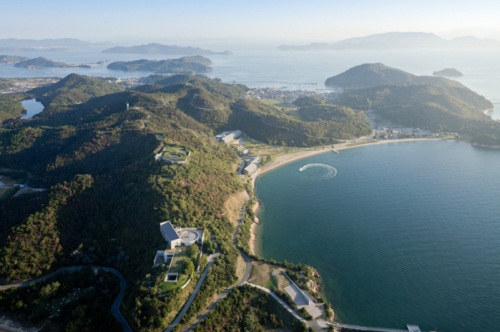
The Japanese project in Benesse Art Site Nahoshima is my favourite one, I must admit. But I would also recommend to give a look to the project by Tadao Ando on the Island of Awaji-Shima. Tadao Ando worked on the island that was partially destroyed to build the Osaka Airport (a man-made island). Even in this case, the park is maintained by the population of the island.

(all images of Awaji-Shima are 2009 ©Beatrice Spolidoro)

And this is the best conclusion for this post, waiting for the upcoming exhibit on Japan, again at the Carnegie Art Museum, titled "Japan is the key" (March 30th July 21st 2013).
Until then, keep fast and MAKE PLACES!

Monday, 2 April 2012

Next Mission: Triennale

What's going on in Triennale? 
Look at this...


I must see it. My passion for Japan is seeking for more and more Japan, every day!

(March, 17th - April, 15th)

Saturday, 31 March 2012

Oki Izumi: Deconstructionism and "re-composition"


Some days ago I came upon an art gallery in Via Marsala, "Paraventi Giapponesi, Galleria Nobili". I suddenly stopped walking, to look at the window, because I saw little pieces of art that impressed me a lot. Even If the were just little compositions made of glass, they were so beautiful that I had to enter the art gallery and ask for some information. 

In this way, I discovered the work of Oki Izumi, a japanese lady working in Milan and producing glass sculptures (of different sizes) and jewels. She calls the jewels "sculptures to be worn" - smart and cool idea, perfectly suitable for the never-satisfied-with-the-simple-things Milan. 


I also asked for the brochure and visited here elegant website, where you can also find some videos about her. In the brochure I had by the gallery manager, I found a description of Izumi's work that put me in the right conditions to introduce her here, in this personal subjective selection of art and creativity. I hope you'll be enthusiastic about her as I am.

(all the following images are taken from Oki Izumi website - go there to see even more!)


Oki Izumi is "special for glass" and her technique is very clear and precise (two fundamental qualities for a good piece of art). She works with glass sheets, of different thickness, and creates sculptures of any dimension. They could be big or small, but always appealing and somehow magnetic (not a banal quality for the glass!!).
They are magnetic in the way they reflect the light and create a sort of inviolable space, made of air, surrounding the pieces. 
The glass so treated is no more only a material, but not even just an idea of transparency and pureness (as it was for the Western countries, when we started making building out of glass, looking for a sense of purity of the constructive field - see P. Behrens).
Matteo Galbiati wrote (Nov 2011) that her pieces aren't mere objects, but are pieces of art since she takes out, from the "cool" glass, a sort of vital energy. <The glass crystalize the invisible, and the artist has understood the power of this solidification of the immaterial>. It is the light that gives importance to this sculptures, without that the final effect would not be the same. No light, no magic.

The works that impressed me more were the small buildings made of glass, or just the ones recalling me an idea of construction or urban panoramas. I'll talk of this personal feeling, here.
This small creations made me think of the Deconstructionism and the current appreciation of "fluid architecture" as Zaha Hadid ones (just to give you an idea of what I'm talking of). 

I think that this general madness for plastic and new materials (better appreciated if specially invented for one-time use) is evidently silly, compared with the simplicity of the glass. In this reasoning, the glass can be assumed as a "champion" of the traditional materials. 
Why should we fill our house with melted tables or collapsed chairs, proportionally expensive to their decomposition level? It is always possible to create something new and interesting with sample shapes, if well used. Miss Izumi clearly represents this possibility. What's the use of blob furniture or buildings with identity crisis? 
Don't tell me it's just the need of something new, because I'm intelligent enough not to be satisfied with  this. No more! 

In Izumi's art, the decomposition of the glass into sheets goes on with the re-composition of the pieces. I think it's like the principle of the Yin and of the Yang: there is no pleasure without the pain, there is no happiness without the sadness. In her work, I would say that the deconstructionism is fundamental as the recomposition is. She does not obtain her pieces without putting them again together, according to the inspiration and her sensibility. This is another quality of her work.

I think that a certain kind of architecture, nowadays so diffused also thanks to the 3D technology, definitely lack of something. It lacks a sense. It lacks the recomposition of the pieces. It's just like a Lego house, when you open the pack and take out the pieces. It's THEN that you have to put them together!
Fluid architecture and melted shapes are just the updated idea of the Deconstructionism to the current era. They can be interesting for some time, usually the time to see them on a magazine. But then, to me, nothing remain.


Monday, 23 January 2012

Precious Pics

A friend of mine linked me this website with incredible photos from the no-go-zone in Fukushima.
I think this is very important, beside being something really worth seeing.
The photographer is Pierpaolo Mittica.

I also remember you that on March, 11th 2012 it will be exactly one year from the tsunami.
Not to forget this...

ps. for the Italian friends: I suggest you also the book "Tsunami nucleare" by Pio d'Emilia
http://blog.wired.it/otakunews/2011/06/09/tsunami-nucleare-tohoku-banzai.html

pps.for the friends coming from Milan: you'll find that at Hoepli Bookshop